Slaab Variable Family Collection



Slaab
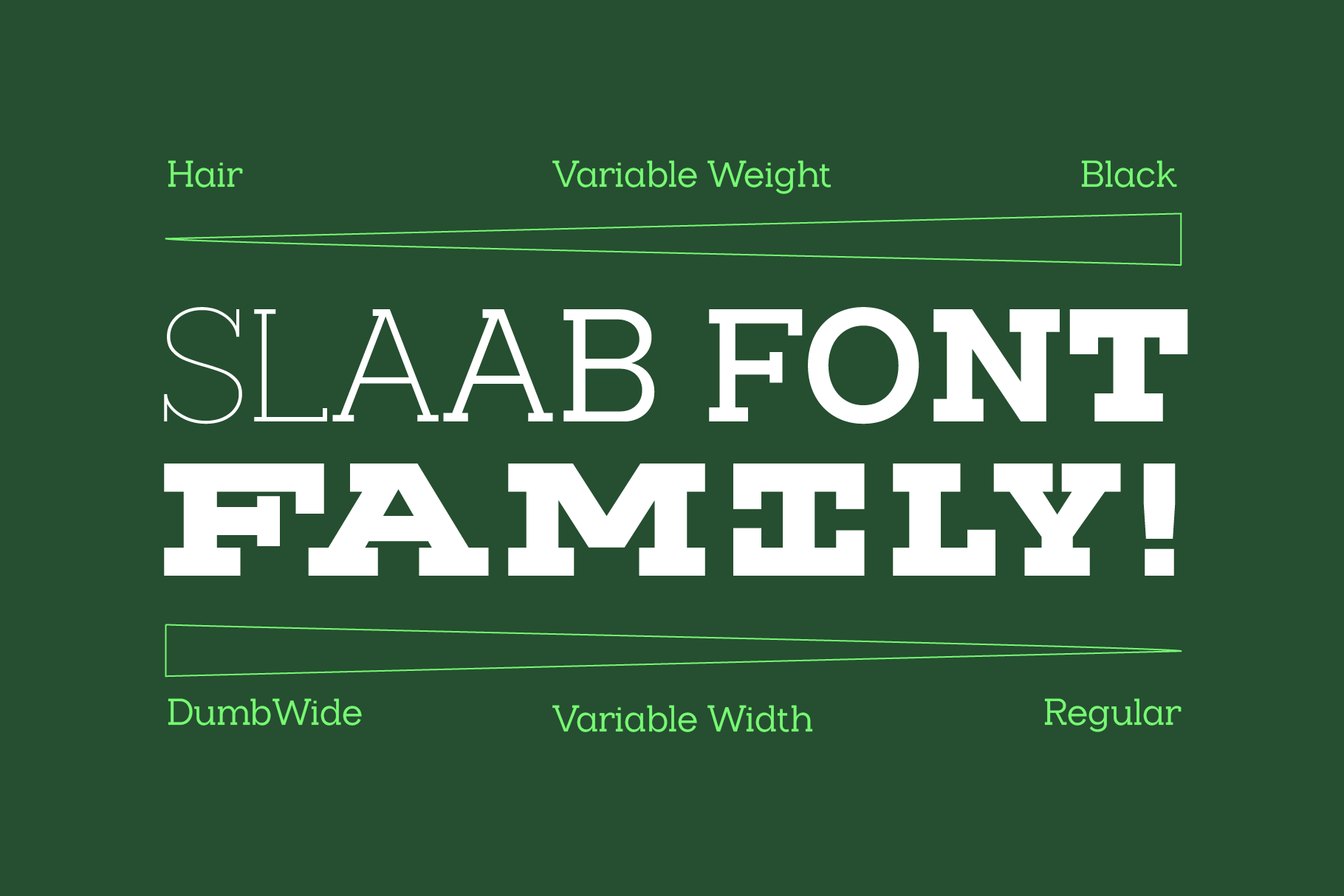
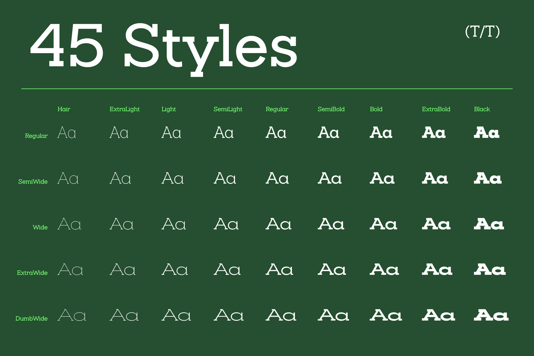
Hair ExtraLight Light SemiLight Regular SemiBold Bold ExtraBold Black SemiWide Hair SemiWide ExtraLight SemiWide Light SemiWide SemiLight SemiWide SemiWide SemiBold SemiWide Bold SemiWide ExtraBold SemiWide Black Wide Hair Wide ExtraLight Wide Light Wide SemiLight Wide Wide SemiBold Wide Bold Wide ExtraBold Wide Black ExtraWide Hair ExtraWide ExtraLight ExtraWide Light ExtraWide SemiLight ExtraWide ExtraWide SemiBold ExtraWide Bold ExtraWide ExtraBold ExtraWide Black DumbWide Hair DumbWide ExtraLight DumbWide Light DumbWide SemiLight DumbWide DumbWide SemiBold DumbWide Bold DumbWide ExtraBold DumbWide BlackSlaab Variable
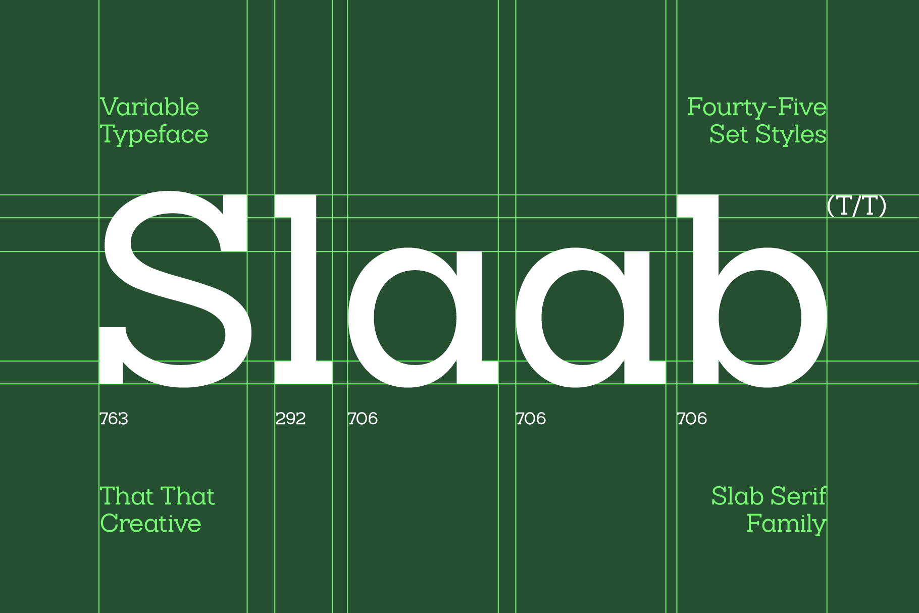
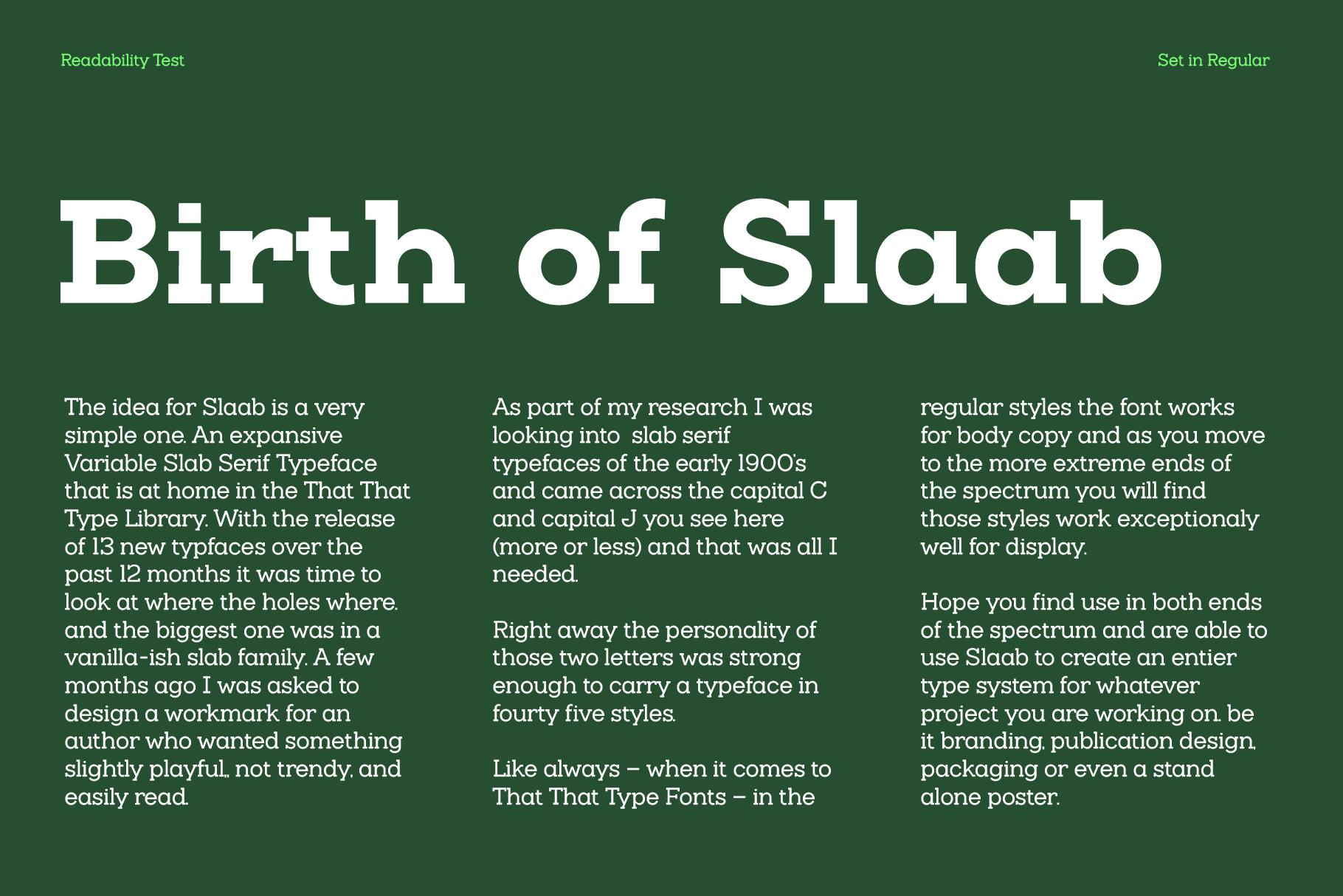
Hair ExtraLight Light SemiLight Regular SemiBold Bold ExtraBold Black SemiWide Hair SemiWide ExtraLight SemiWide Light SemiWide SemiLight SemiWide SemiWide SemiBold SemiWide Bold SemiWide ExtraBold SemiWide Black Wide Hair Wide ExtraLight Wide Light Wide SemiLight Wide Wide SemiBold Wide Bold Wide ExtraBold Wide Black ExtraWide Hair ExtraWide ExtraLight ExtraWide Light ExtraWide SemiLight ExtraWide ExtraWide SemiBold ExtraWide Bold ExtraWide ExtraBold ExtraWide Black DumbWide Hair DumbWide ExtraLight DumbWide Light DumbWide SemiLight DumbWide DumbWide SemiBold DumbWide Bold DumbWide ExtraBold DumbWide Blackhe idea for Slaab is a very simple one. An expansive Variable Slab Serif Typeface that is at home in the That That Type Library. With the release of 13 new typfaces over the past 12 months it was time to look at where the holes where. and the biggest one was in a vanilla-ish slab family. A few months ago I was asked to design a workmark for an author who wanted something slightly playful,, not trendy, and easily read.
As part of my research I was looking into slab serif typefaces of the early 1900’s and came across the capital C and capital J you see here (more or less) and that was all I needed.
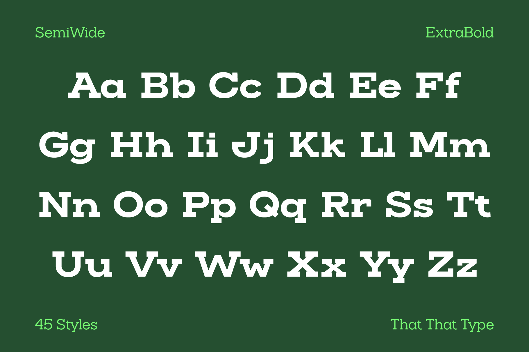
Right away the personality of those two letters was strong enough to carry a typeface in fourty five styles.
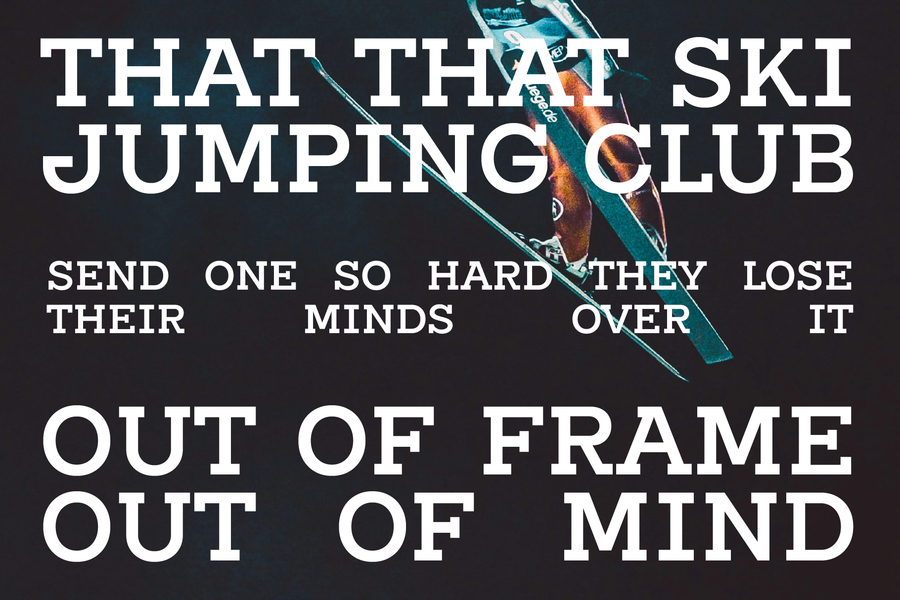
Like always – when it comes to That That Type Fonts – in the regular styles the font works for body copy and as you move to the more extreme ends of the spectrum you will find those styles work exceptionaly well for display.
Hope you find use in both ends of the spectrum and are able to use Slaab to create an entier type system for whatever project you are working on. be it branding, publication design, packaging or even a stand alone poster.